From zero signups to 45% pipeline conversion
How I redesigned EASeJ's self-serve trial to go from zero signups to 45% pipeline conversion
- - UX/UI Design
- - Strategy
- - Stakeholder Management
- - Prototyping
- - User Research
EASeJ (Enterprise Application Service for Java — IBM’s platform for automating enterprise application deployment, compressing weeks of engineering coordination into under an hour) had a working product and near-zero signups.
The technology wasn’t the problem, the path to discovering it was.
The best enterprise software doesn’t close deals through polished demos. It closes them by letting buyers, and often the end users, evaluate the product themselves, on their own terms.
The trial redesign was built on that bet and lead the redefinition of the trial experience from the ground up:
Strategy, research, the setup flow, and two critical decisions that determined whether the product could launch at all.
Within a week of going live on AWS Marketplace, 45% of trial users converted to a sales-led proof of concept, against near-zero signups in the three months before.
I spoke to the sales team, go-to-market team and users to understand what caused our trials to fail. The problem was two fold:
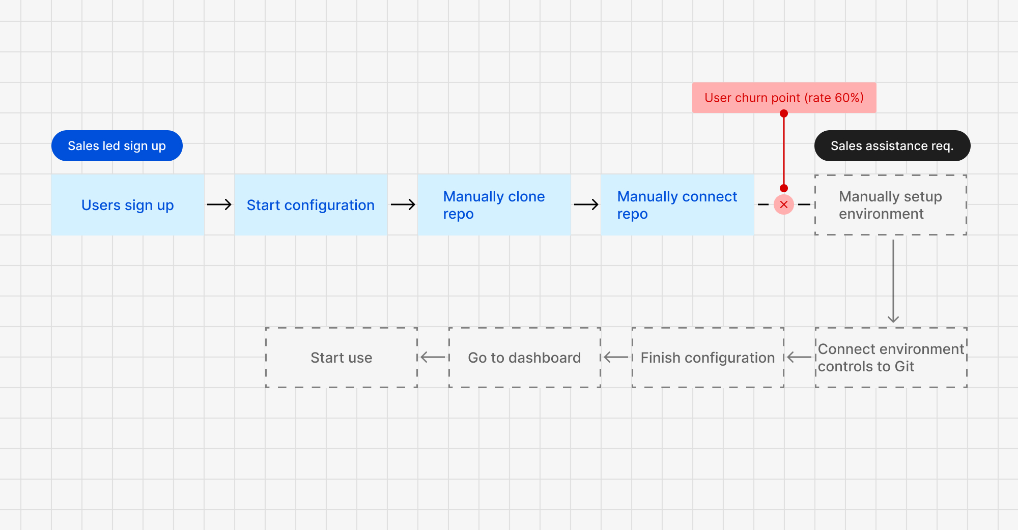
Every adoption path ran through a sales rep. They’d reach out, run a manual demo, and close the deal. No rep meant no deal.
A self-serve trial existed, but finishing it meant cloning two repos, manual configuration, and 15 minutes of setup 60% developers wouldn’t complete.
The product was good. The path to discovering that was broken.
Before touching any design, I needed to align 10 stakeholders, spanning go-to-market, product management, engineering, and design leadership, on what a “good trial” actually meant, and for whom.
I ran a structured workshop to drive alignment across key stakeholders. We did an ideation session to understand 3 key things:
- Who is the trial for
- What are the Aha! (Wow) Moments for them
- How do we approach them
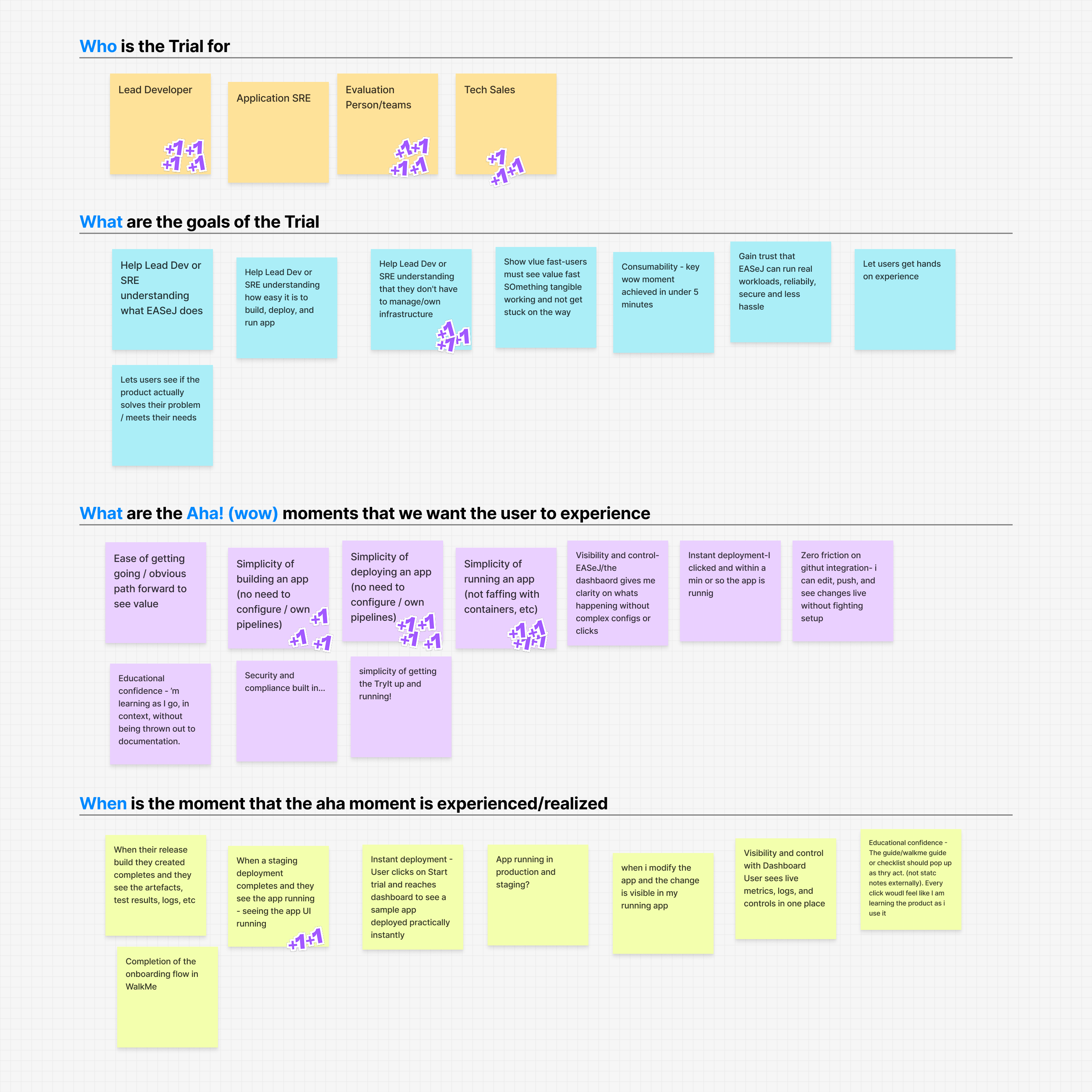
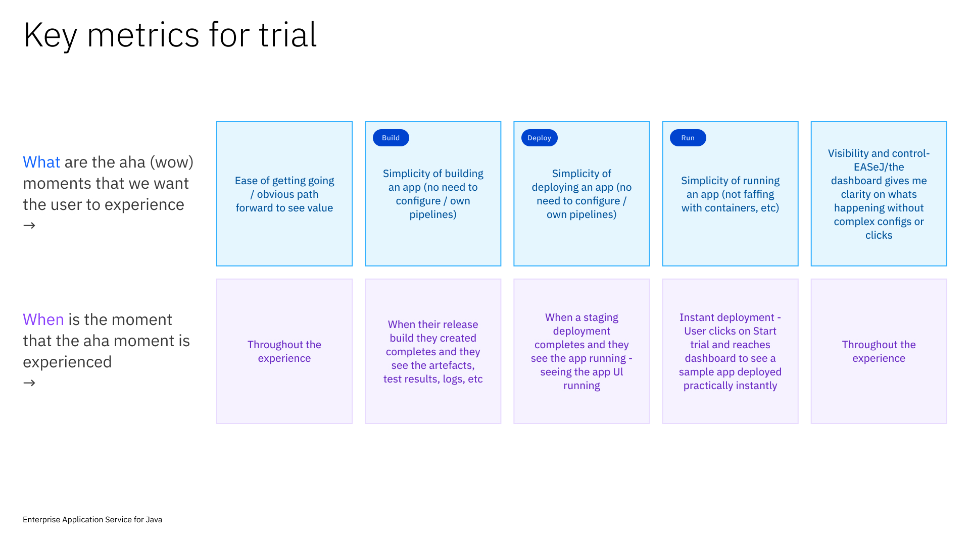
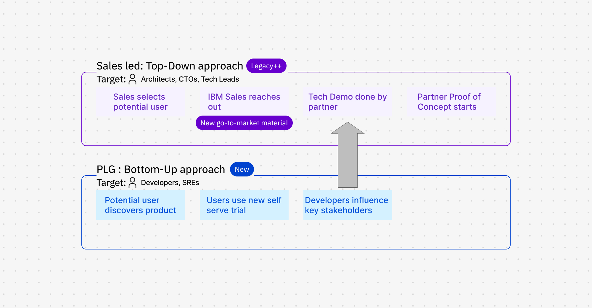
The outcome of the workshop was key defined goals and north start metric which would guide every following decision. Additionally working with PM and GTM I pushed for two parallel tracks rather than one:
That constraint made every subsequent decision easier, either it got us closer to 2 minutes, or it didn’t make the cut.
I spoke with 10 users across two groups: developers who would run the trial and engineering leaders who would approve adoption.
Decision-makers had seen enough polished demos that didn’t survive contact with reality. A trial they could run themselves, at their own pace, carried more weight than anything a sales rep could show.
Engineering leads and developers flagged the same gap from different angles: the generic sample app didn’t reflect their real workloads. A trial that doesn’t mirror real conditions can’t produce real conviction.
Sponsor user team:
I also assembled a panel of five sponsor users from the initial ten, available to test with throughout the project. That panel ended up being the deciding factor at the most critical point in the work.
Two constraints shaped this project more than any screen I designed. Neither was a visual problem.
Where does the sandbox live
EASeJ needs two repositories to work. The existing trial made users clone both manually the main reason 60% dropped off before seeing anything.
Two fixes on the table:
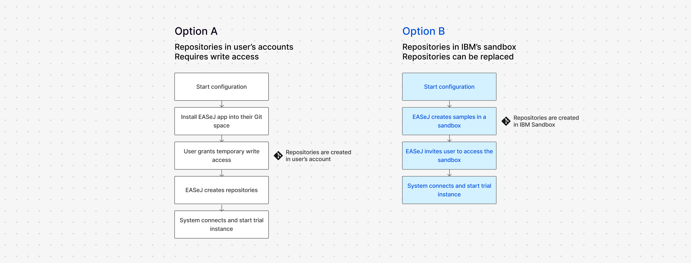
Option A was fewer steps, faster, cleaner. I pushed for it. The sponsor user panel shot it down. Write access to their accounts, even temporary, even for a throwaway project, wasn’t happening.
We moved to Option B. Turned out to be the better call anyway; users never had to leave the product to complete their first action.
Solving a performance problem through design
Repos sorted, instances still took ~5 minutes to start. The culprit: rebuilding the sample app from source on every signup.
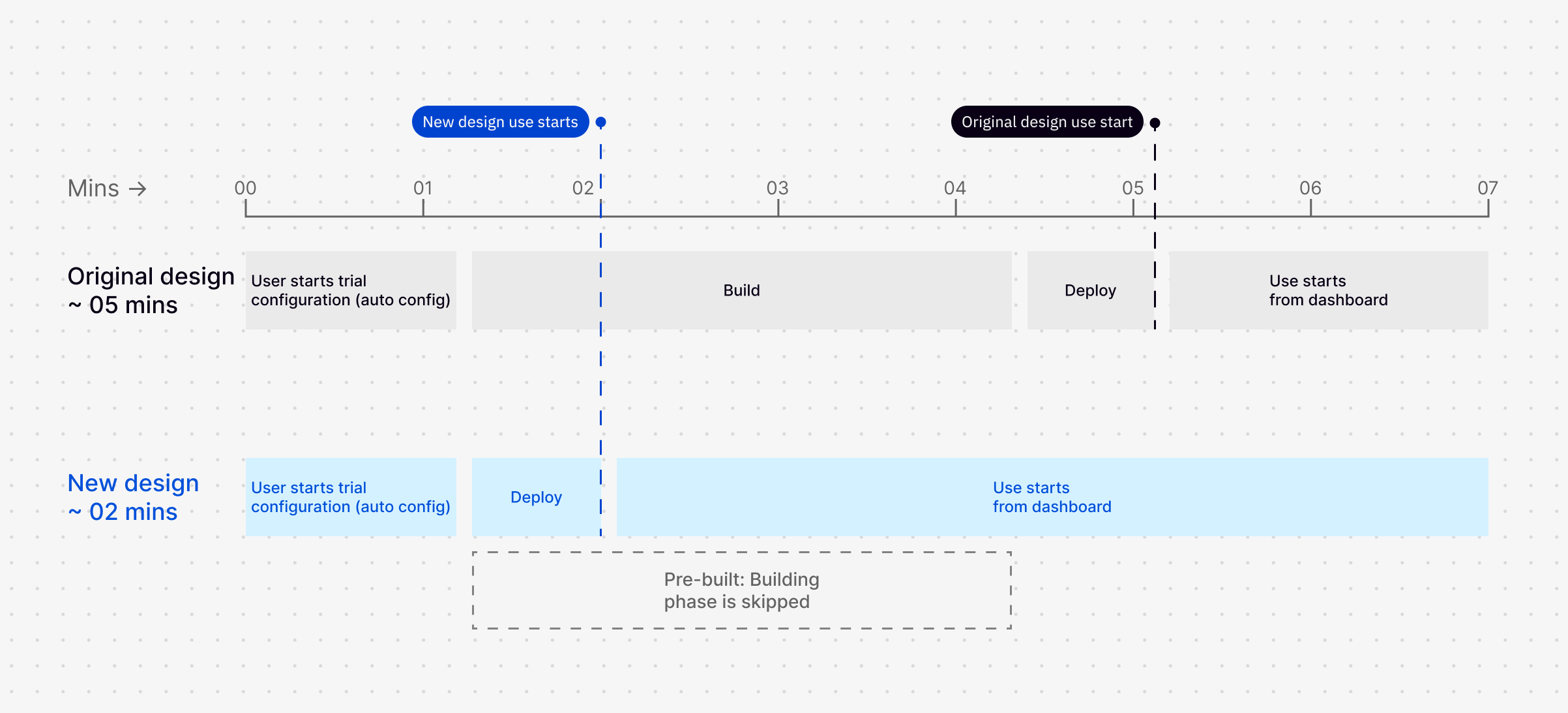
One question to the chief architect: every user runs the same app, why build it fresh each time?
Pre-build it once, skip the step on signup.Startup dropped to 1–2 minutes. This became the technical foundation of the trial.
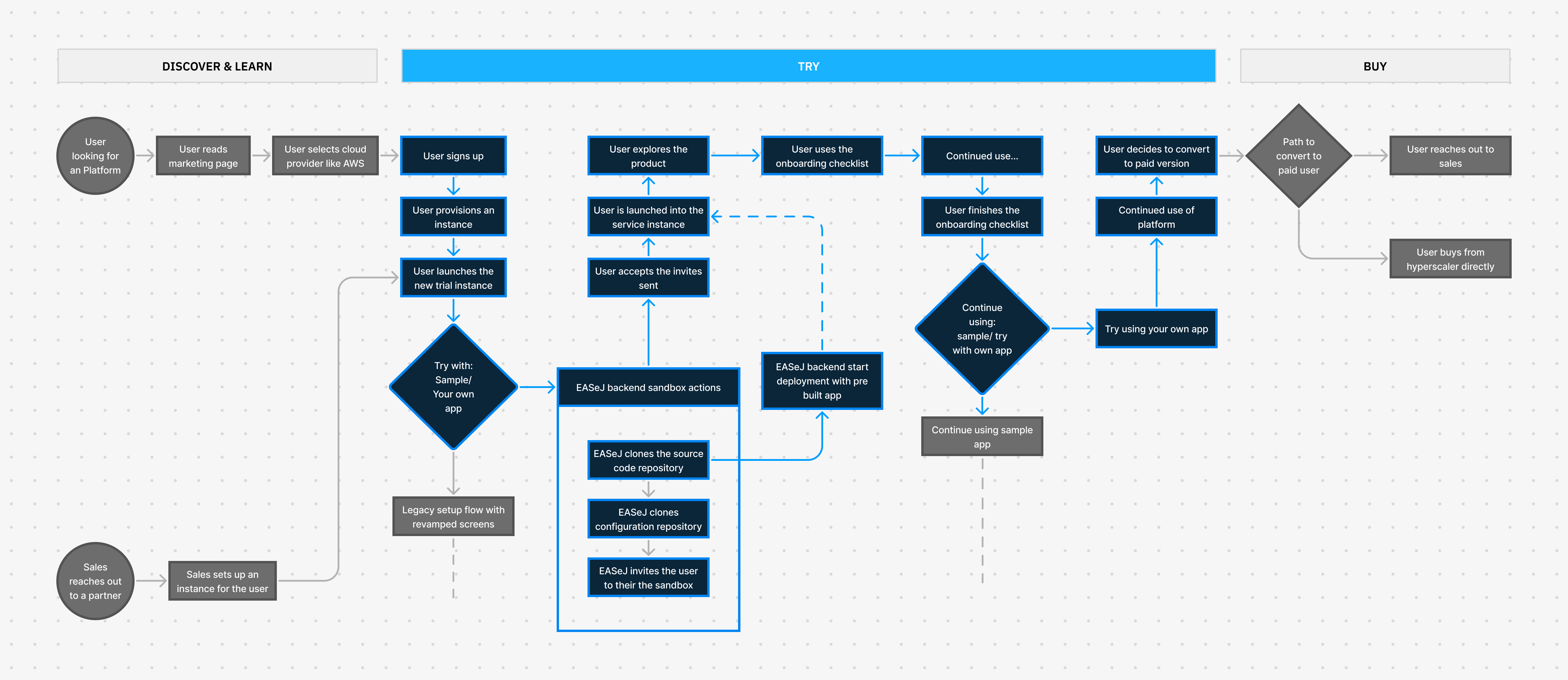
Final userflow
The final userflow agreed upon for the MVP
The 1.5-month delivery window was the right constraint for launching, but it meant a number of well-developed design proposals didn’t ship. Rather than let those ideas dissolve at the end of the project, I used them.
I did an ideation phase focused on the sample mismatch finding — the gap research had surfaced but the MVP couldn’t close — and developed design proposals across three delivery phases.
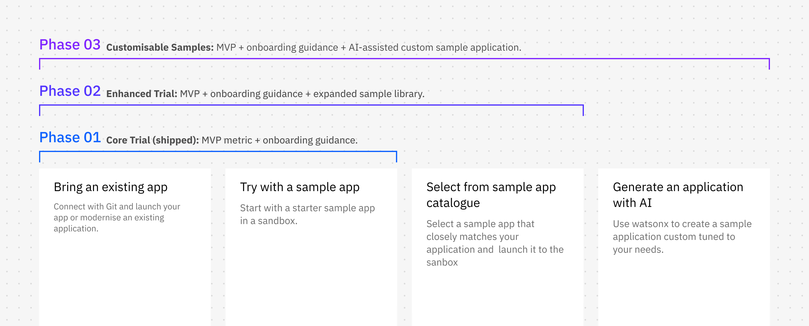
Every design decision traced back to the 2-minute north star. The goal was to remove decisions from the user’s path, not add features to it.
Setup flow - Zero to live in under 2 minutes.
Two required interactions: start the setup, accept a repository invite. Users with their own application can connect it upfront; everyone else starts with IBM’s sample and can switch once they’ve seen the product working.
Step-by-step setup UI - Progress as reassurance.
I replaced form-heavy screens with a step-by-step interface showing what’s happening as it happens. During the 1–2 minute wait, users watch the deployment run in real time, turning waiting into a product demonstration.

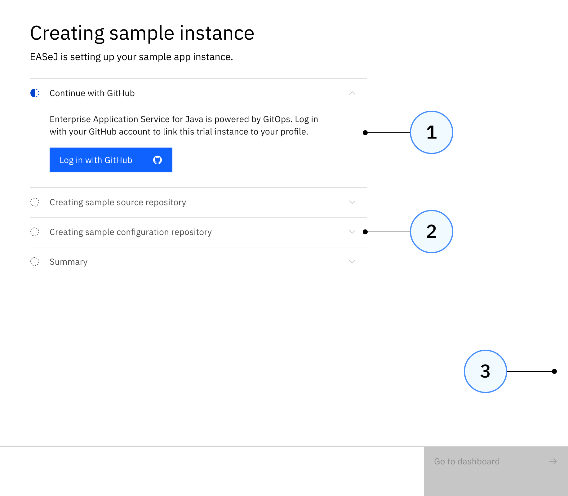
- Condensed steps into accordian like sections so that users can complete all actions in one page
- Used progressive disclosure to control cognitive load and help users focus on task at hand
- Added microinteraction to convey a stronger brand expereince and also to visually show the progress to the user
“Try with your own app” prompt - From evaluation to intent.
After completing the checklist with the sample application, users are invited to test their own application on the same instance — no new signup, no starting over. This was the transition from “I tried it” to “I evaluated it,” and it directly drove conversion to sales-led proofs of concept.
Launched alongside EASeJ’s debut on AWS Marketplace.
trial users converted to a larger, sales-led proof of concept — generating direct pipeline for the business
of trial instances were live within the 2-minute north star target
users completed the full onboarding checklist and tested with their own application
The one north star we didn’t hit was 50% trial-to-paid subscription conversion within 3 months. The 45% POC conversion rate suggests serious buyer intent was there, the direct trial-to-paid path likely needed a longer measurement window than we had at launch.
The pre-build decision didn’t come from a design review. It came from a working session where I showed up with a specific question, and that changed what the product could do at launch. That’s the version of design contribution I want to be known for: not just delivering screens, but changing what’s possible.
The write-access finding was a useful correction. I had a UX preference; users overruled it; the product was better for it. A sponsor user panel is only worth building if you’re willing to let it change your mind.
What I’d do differently: push earlier for a shared definition of success across 3, 6, and 12 months, not just the launch quarter. A redesigned trial changes behaviour gradually. The 45% POC conversion rate suggests the intent was there. We needed more time to see it close. I’d fight for that measurement window at the start of the project, not the end.